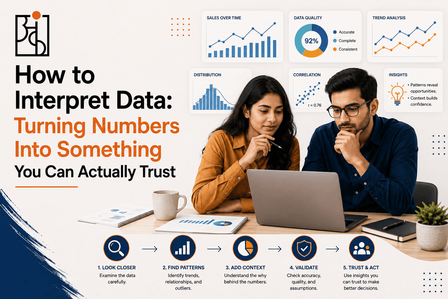
How to Interpret Data: Turning Numbers Into Something You Can Actually Trust

An HR team once watched their annual engagement survey score drop six points in a single year and spent a full quarter planning a culture overhaul in response — new recognition programs, revised management training, a whole initiative built around the assumption that something had genuinely gone wrong with how people felt about working there. It hadn’t. Buried in a footnote nobody read closely, the survey vendor had changed the wording of several questions that year, including the one most heavily weighted in the overall score. People weren’t less engaged. They were answering a subtly different question than the year before, and the six-point drop was measuring that shift in wording, not a shift in morale.
Table of Contents
Nobody on that team was careless, exactly. They did what most people do with a number that looks alarming — they trusted it, then reacted to it. What they skipped was the step in between, the one where a number gets interpreted rather than just read. That step is where data analysis actually earns its value, and it’s a skill anyone can build, with or without a background in statistics.


How to Think About Data Before You Try to Interpret It
The biggest shift in how skilled analysts operate isn’t a technique, it’s a starting posture: data is evidence to be weighed, not a verdict to be accepted. A number on a dashboard feels authoritative simply because it’s a number, precise-looking and specific. That precision is often doing more persuading than it’s earned. A figure like “engagement dropped 6 points” carries the same visual weight whether it reflects a genuine cultural shift or a change in how the underlying question was worded, and nothing about the number itself signals which one you’re looking at.
This means the first honest question to ask of any dataset isn’t “what does this show,” it’s “what would have to be true for this number to mean what I think it means.” The HR team’s assumed meaning — people are less engaged — required the measurement process to have stayed identical year over year. It hadn’t. Checking that single assumption before building an entire response plan around the number would have saved a quarter’s worth of misdirected effort.
Thinking about data well also means holding two possibilities open at once for longer than feels natural: the number reflects something real, or the number reflects something about how it was measured. Both are common. Neither should be assumed by default, and the only way to tell them apart is to actually go check, rather than picking whichever explanation feels more urgent or more interesting in the moment.
How to Interpret Data Once You Have It in Front of You
Interpretation starts with context, and a number without context is barely a number at all — it’s a fragment waiting to be misunderstood. A farmer looking at this season’s crop yield sees a number that’s either impressive or alarming depending entirely on what it’s compared against. Compared to last year’s drought-affected season, an average yield looks like a genuine recovery. Compared to a five-year average from normal rainfall years, that same number might reveal the field is still underperforming in a way worth investigating. The yield figure never changes. What it means shifts entirely based on the comparison point chosen, which is exactly why picking that comparison point deliberately, rather than accepting whatever comparison happens to be presented, matters so much.
Interpreting data also means paying close attention to what unit of measurement is actually being used, since the same underlying reality can look completely different depending on how it’s expressed. A startup watching its app store rating slip from 4.6 to 4.3 after a major update might read that as a modest, tolerable dip. Look at the actual review volume behind that average and it’s possible the drop reflects a genuine surge of one-star reviews specifically about a broken feature, diluted by a much larger base of unaffected long-term users still rating the app highly out of habit. The average smooths over exactly the detail that matters most for deciding whether the update needs an urgent fix or just some minor polish.
A particularly useful interpretation habit is checking whether a number is describing a level or a change, since the two get confused constantly and mean very different things. “40% of students passed the new assessment” describes a level — it says nothing about whether that’s better or worse than before. “Pass rates fell 10 points” describes a change, but says nothing about where the rate landed or whether 10 points actually represents a meaningful shift for that particular subject and grade. Real interpretation usually needs both pieces together, and a report that only offers one is quietly withholding the other half of the story.
It also matters whether a number is describing an average outcome or a typical one, and the two are not the same thing despite getting treated interchangeably in most casual reporting. A neighborhood’s average household income can be pulled sharply upward by a handful of very high earners, painting a picture of prosperity that the typical household in that neighborhood wouldn’t recognize at all. The median — the actual middle value — usually tells a more honest story about what a typical resident’s situation looks like, and the gap between the average and the median is itself a useful piece of information, since a wide gap signals real inequality hiding underneath a single reassuring headline figure.
Read More: How AI Is Transforming Data Analytics in 2026: A Complete Guide
How to Draw Insights From Data Instead of Just Describing It
An insight is different from an observation, and the gap between the two is where most of the actual value in data work lives. “Weekend app usage is higher than weekday usage” is an observation — true, easy to state, and largely useless on its own. “Weekend usage skews toward a different feature set than weekday usage, suggesting people are using the app differently depending on whether they’re at work or not” is closer to an insight, because it points toward something that could actually change a decision, like which features to prioritize building for which day of the week.
Getting from observation to insight usually means asking “so what” of a finding before writing it down as a conclusion. A fitness app noticing that daily step counts drop sharply every December might stop at describing the seasonal dip. The more useful move is asking what that dip actually implies — maybe it signals an opportunity for a winter-specific indoor workout campaign timed exactly to the weeks when outdoor activity naturally falls off, turning a passive observation about behavior into an active decision about what to build or promote next.
Insights also tend to hide in the places a report doesn’t naturally draw attention to — the segment nobody separated out, the exception that got smoothed into an average, the comparison nobody thought to run. A school reviewing standardized test scores citywide might see a small, unremarkable overall improvement and consider the intervention that year a modest success. Break that same data down by which schools received extra resources and which didn’t, and the citywide average might be masking a much sharper improvement concentrated in the funded schools, sitting right alongside flat or declining scores everywhere else. The insight was never visible in the city-wide number. It only showed up once someone thought to slice the data along a line that actually mattered.
Read More: How AI Is Transforming Data Analytics in 2026: A Complete Guide
How to Question Data Before You Trust It
Every dataset carries a set of decisions baked into it before it ever reaches a report — what got measured, what got left out, how the measurement actually happened — and questioning data means surfacing those decisions rather than accepting the final number as a neutral fact.
Start with where the number actually came from and how it was collected. A customer satisfaction score gathered only from people who responded to a post-purchase email says something real about that specific group, but it says nothing at all about customers who never opened the email, and those two groups aren’t necessarily similar. The score can be entirely accurate for the sample measured and still tell a badly incomplete story about the customer base as a whole.
Sample size deserves the same scrutiny every time a percentage shows up without its underlying count attached. “72% of surveyed employees support the new policy” reads very differently depending on whether 720 people answered or 25 did, and the percentage alone gives no hint which one you’re looking at. Asking for the raw number behind any percentage is a small habit that catches an enormous number of overstated claims before they get treated as settled fact.
It’s also worth asking whether the measurement method itself changed at some point during the period being reported, the way it did with that HR survey. A comparison across time only means what it appears to mean if the thing being measured, and the way it’s being measured, stayed consistent throughout. A shift in wording, in tooling, or in who’s included in the count can produce a change in the number that has nothing to do with a change in the underlying reality, and that possibility is worth ruling out before any conclusion gets built on top of a trend line.
Finally, it helps to ask who benefits from a particular interpretation before accepting it, without assuming bad faith. A vendor presenting their own product’s usage data has a genuine incentive to frame numbers favorably, not necessarily through dishonesty, but through which comparisons get highlighted and which get left out of the slide. Noticing that incentive doesn’t mean dismissing the data. It means reading it slightly more carefully, checking the framing against the raw numbers underneath it, rather than accepting the interpretation exactly as presented.
None of this scrutiny needs to feel adversarial, even when it’s aimed at a colleague’s report or a vendor’s pitch. The most useful framing is simply curiosity rather than challenge — approaching a number the way a good editor approaches a draft, assuming it’s probably mostly right but checking the specific places where an error would be easy to miss. That posture tends to get better answers from people than outright skepticism does, and it catches just as many real problems along the way.
Read More: How to Improve Logical Thinking: A Practical Guide to Thinking Critically
Bringing These Habits Together
None of this requires treating every number with suspicion or grinding every decision to a halt over a spreadsheet. It requires knowing which moments actually call for this level of scrutiny — usually the ones where a number is about to justify a real decision — and having a short list of questions ready for exactly those moments. What is this being compared against. Did the measurement method stay consistent. What’s the sample size behind this percentage. Who’s missing from this dataset entirely.
The HR team’s six-point drop, run through even a couple of these questions, would have surfaced the wording change well before a quarter’s worth of culture initiatives got built around a number that was measuring something other than what everyone assumed. That’s really the whole case for interpreting data carefully rather than just reading it: the cost of the habit is a few extra minutes of checking, and the cost of skipping it is sometimes a full quarter spent solving a problem that was never actually there.
Frequently Asked Questions
Q1.What’s the single most useful question to ask when interpreting a new number?
Compared to what?” A number in isolation is nearly meaningless — it’s the comparison point that gives it shape, whether that’s last year’s figure, a different segment, or an industry benchmark. Most misleading statistics fall apart the moment someone actually names what they’re being measured against.
Q2.How is drawing insights from data different from just interpreting it?
Interpretation figures out what a number actually means in context. Drawing an insight goes a step further and asks what that meaning implies for an actual decision. “Weekend usage is higher” is interpretation. “That suggests we should build weekend-specific features” is the insight built on top of it.
Q3.Is it possible to question data too much and never trust anything?
Yes, and it’s a real failure mode once these habits become second nature. The fix is scaling scrutiny to the stakes — a low-stakes, easily reversible decision doesn’t need the same interrogation as a report that’s about to justify a major strategic shift. Constant blanket suspicion isn’t critical thinking, it’s just a different kind of unhelpful bias.
Q4.What’s the fastest way to start thinking more carefully about data day to day?
Pick one number that gets casually repeated around you — at work, in the news, from a friend — and ask two questions before accepting it: what’s it being compared against, and what’s the sample size behind it. That habit alone catches a surprising share of claims that don’t hold up once actually checked.
Related posts

How Data Analytics Helps Businesses Think With Data

Data Analytics for Working Professionals How to Actually Learn It Without Quitting Your Job